

Generate a chart from an answer
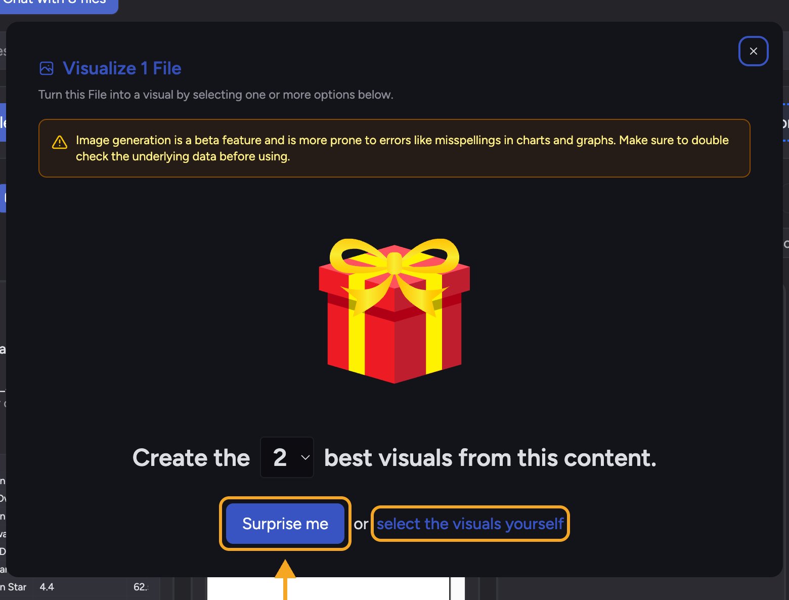
- Ask Chief a question whose answer includes comparable figures (for example revenue by month, or survey results by category).
- When the answer finishes, open the response menu and choose Visualize this answer. (You can also Visualize a File or a Concept — the window that opens is the same.)
- In the Visualize window, choose select the visuals yourself.
- Under Charts & Data Visualizations, click the chart you want — Bar Chart, Pie Chart, Infographic, Comparison Table Graphic, or Word Cloud.
- Click Go.
Pick the right chart
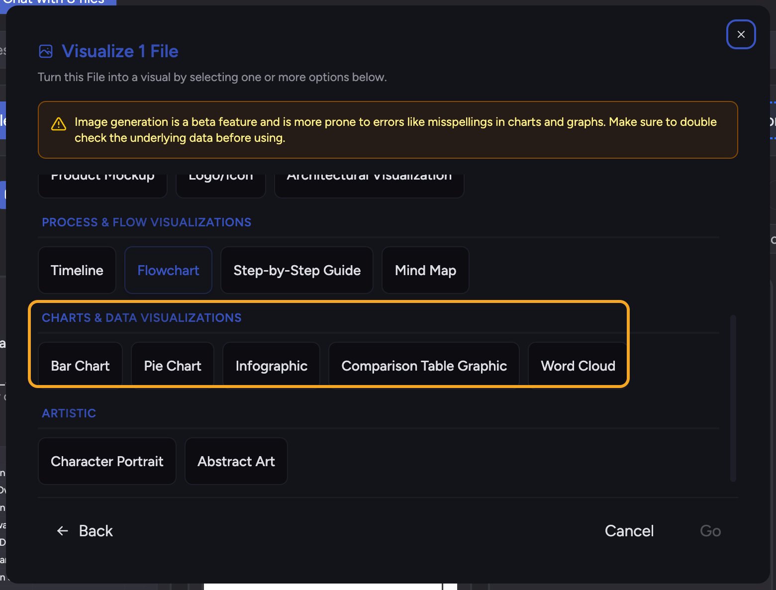
- Bar Chart — compare values across categories.
- Pie Chart — show how parts make up a whole (percentage distribution).
- Infographic — combine a few key stats with icons in a single graphic.
- Comparison Table Graphic — lay items side by side against shared criteria.
- Word Cloud — surface the most frequent terms in text.
Download a chart
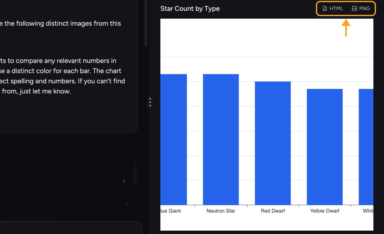
- Click PNG (Download as PNG) for a flat image you can paste into slides or docs.
- Click HTML (Download as HTML) for an interactive version.
FAQ
Chief said it couldn't find numbers for a bar chart.
Chief said it couldn't find numbers for a bar chart.
Bar and pie charts need comparable figures in the answer. If the answer is descriptive only, there’s nothing to plot — re-ask so the answer returns the values, then try again.
Should I trust the numbers in a generated chart?
Should I trust the numbers in a generated chart?
Always verify against the answer’s underlying data. Generated visuals are a beta feature and can occasionally misrender a label or figure, so double-check before sharing.
What's the difference between PNG and HTML download?
What's the difference between PNG and HTML download?
PNG is a flat image, ideal for pasting into a deck or document. HTML keeps the chart as an interactive file you can open in a browser.