

A worked example
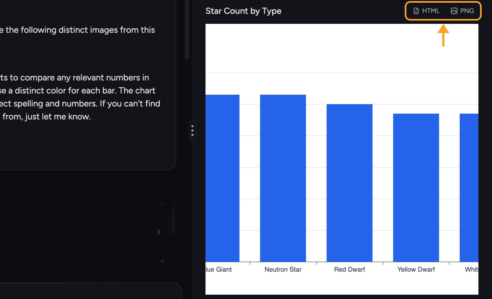
- Open your Library and select a File that contains comparable numbers — for example a spreadsheet (our ACME demo uses a star dataset).
- In the selection toolbar, click Visualize 1 File.
- In the Visualize window, choose select the visuals yourself.
- Under Charts & Data Visualizations, click Bar Chart.
- Click Go.
What you can create
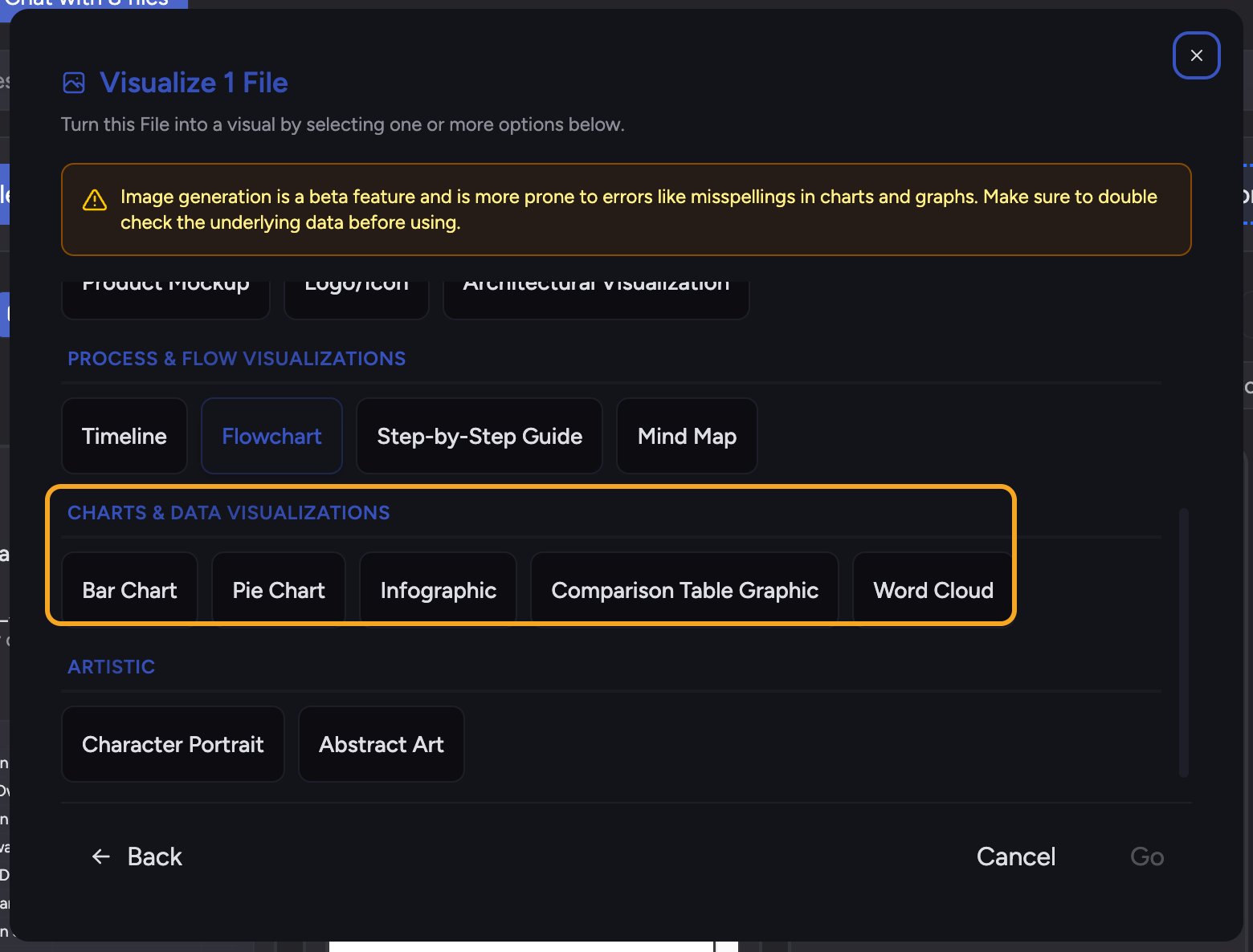
- Charts & Data Visualizations — Bar Chart, Pie Chart, Infographic, Comparison Table Graphic, Word Cloud.
- Process & Flow Visualizations — Timeline, Flowchart, Step-by-Step Guide, Mind Map.
ℹ️ Good to Know: Chief builds charts from numbers that exist in the content. If you ask for a Bar Chart but the content has no comparable figures, Chief tells you instead of inventing data. Make sure the underlying answer or File contains the numbers you want charted before you Visualize it.
Where the Visualize action lives

- On a File — select one or more Files in your Library and click Visualize in the selection toolbar (each File card also has its own Visualize button).
- On an answer — open the response menu under the answer and choose Visualize this answer.
- On a Concept — open the Concept and choose Visualize this Concept.
- On selected text — highlight text inside an answer and choose Visualize from the Do more with this text menu.
Choosing your visuals vs. Surprise me
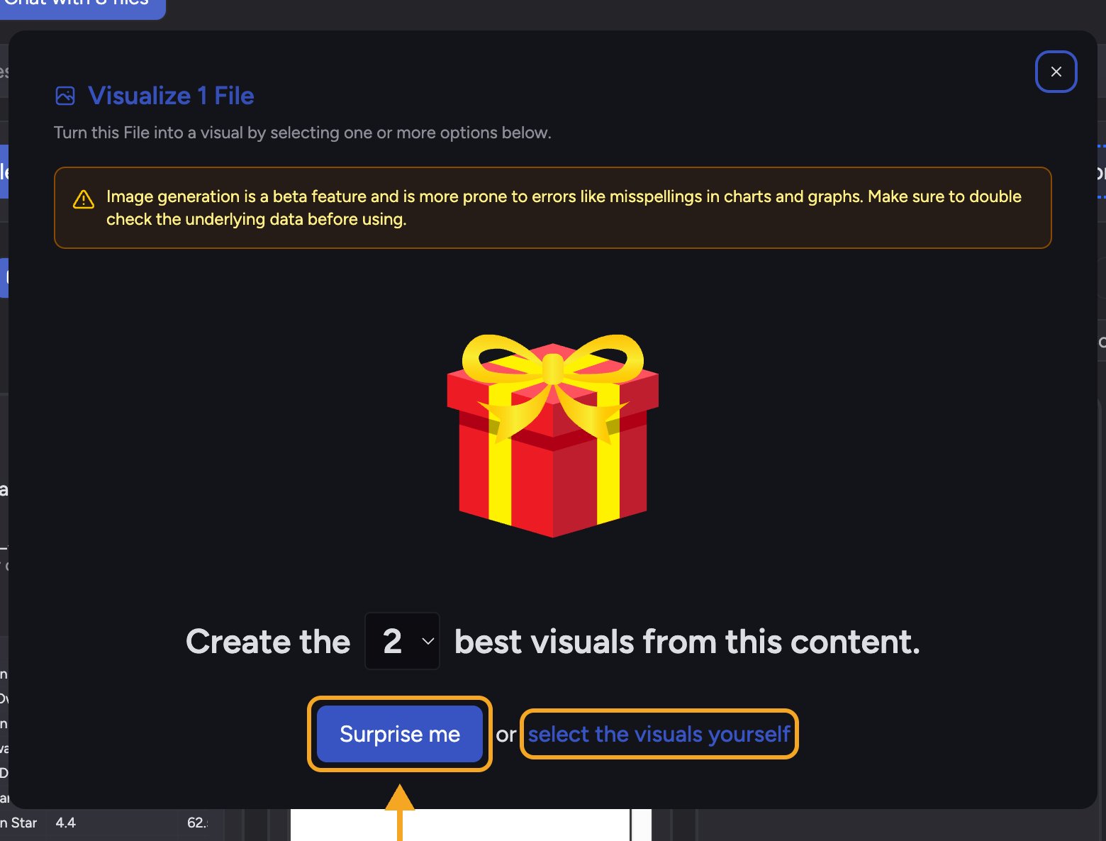
- Surprise me lets Chief pick the most fitting visuals for you — use the Create the N best visuals from this content dropdown to choose how many.
- select the visuals yourself is for when you know exactly what you want — a single Pie Chart, or a Timeline plus a Mind Map together. You can select more than one option at a time.
FAQ
I asked for a chart but Chief said it couldn't find numbers. Why?
I asked for a chart but Chief said it couldn't find numbers. Why?
Charts are built from figures in the underlying content. If the answer or File is descriptive with no comparable values, there’s nothing to plot. Re-ask your question so the answer returns the specific numbers, then Visualize it.
Can I visualize just one section of a long answer?
Can I visualize just one section of a long answer?
Yes. Highlight the text you want, then choose Visualize from the Do more with this text menu. Chief uses only the highlighted text.
The visual got a number or spelling slightly wrong.
The visual got a number or spelling slightly wrong.
Image generation is a beta feature and can occasionally misspell a label or misrender a number — the Visualize window warns you about this. Always double-check the underlying data before you share a visual. See the article on generating images for more on this beta behavior.
Where do my visuals go after I create them?
Where do my visuals go after I create them?
Each one is created as a File, listed under Created Files in the answer. Open it to view it in a panel, download it as PNG or HTML, or keep it in your Project Library to reuse.